Your Choice

After many a day in front of the screen over the last couple of weeks, I’m narrowing down my portfolio choices for both website and printing. As you’ve all become familiar with what I’ve been doing, I thought I’d share my selection to get your point of view to make refinements.

Would very much appreciate it if you could take a look at this album and give me some feedback, please. Whether you hate something, absolutely love it or have left out other images you’ve liked, please tell me! Just make sure it’s constructive and I’ll take it on board…

Pictures on the wall!

It was a most exciting day on Thursday. Not only did I receive my NCFE Level 1 and Level 2 certificates in the post, but my first commission was put into place.

Wonderful to see my artistic vision and hard work in physical form…

chestnut_grove_two_blue

Couldn’t have done, though, without the belief and guidance of Paula Trovalosci. Paula is the talented and visionary interior designer who spotted the potential in my work. Also, the skills, technique and experience of The Print Foundry who printed and framed the pieces.

Becoming very real now!

Dreams/Reality Final FINAL!

Last week I thought I’d had this project in the bag. Confident in my final choices, I took my prints to the classroom.

They looked great on screen & on my living room floor. Laying them out on the classroom table proved otherwise. After a tough few minutes, the images I chosen were mixed, matched, turned round & assessed. After a vibrant & healthy class discussion regarding criticism I was still adamant that my final decision was final.

However, over the next few days, something was gnawing away at the back of mind. I’d finished the course, settled on my final photos & added all course criteria references to my blog posts. I should be able to relax & enjoy my summer now. Why was I not able to let this go?

The next day, I chose to get the second opinion of a friend whom I trust. She has a very good eye for detail & colour. She also doesn’t pussyfoot around – if she doesn’t like something she’ll say so. Then explain why. It was also the first time she’d seen the prints, rather than just looking at the images on the screen, so she was seeing these with fresher eyes.

At first she liked the initial arrangement, then started making a few tweaks herself. Nothing major, but enough to realise that changes needed to be made. Secondly, there were other images I had printed, but not included, that she preferred. These particular images were ones which other people had picked up on & some of my personal favourites.

Time for rethink, methinks… maybe I was trying to hard with the final selection. Was I letting my aesthetic eye for patterns & matching colour get in the way. Was I being too tasteful? I remember my classmate Claire asking the question in a previous session “should I make my images more subtle?” We gave her a resounding “no”.

Right, back to the drawing board. Or should that be the living room floor… I also returned to the ethos of Surrealism itself. If the Surrealists were nonconformists then why should my final selection conform either?

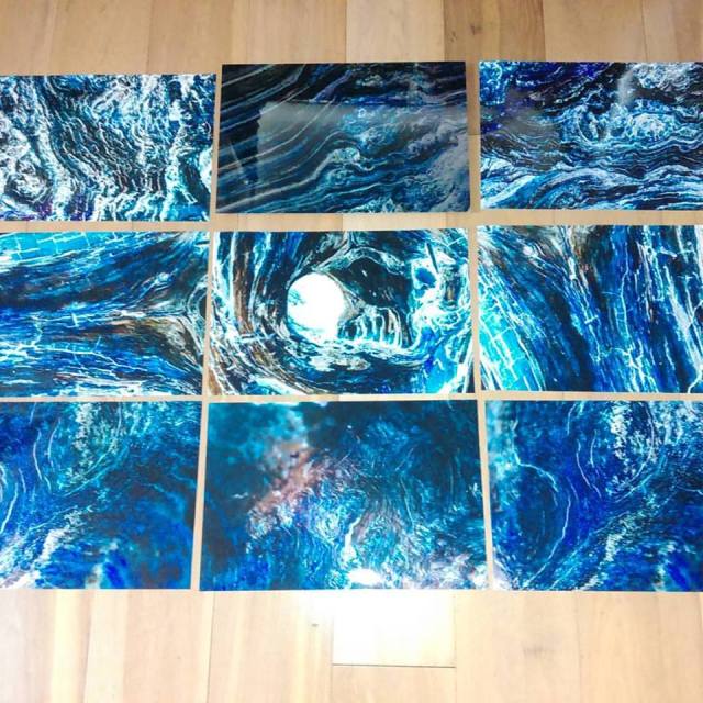
Then I decided to go for a spot of automatism. Go for the five images I like best – no matching, no logic – just go for the ones that jump out. The ones I picked were those in which I kept seeing new things each time I looked at them. These were also images from which I received the best responses from others.

The result was an eclectic mix of five images, but this was quite dream-like in itself. Like the morning after when you wake from a vivid dream. You can recall certain scenes or aspects, but nothing cohesive. The you fixate on the flashbacks, focusing on the smaller details. There are sensations, emotions, revelations but still no sense of reality. As with these images, reality is just a bare boned echo recreating something else.

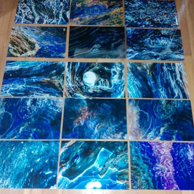
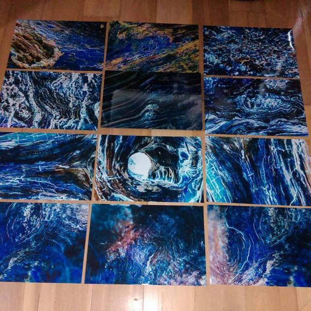
Then I arranged the images into a grid, moving things round until I came up with this arrangement.

DreamsRealityFinal5.jpg

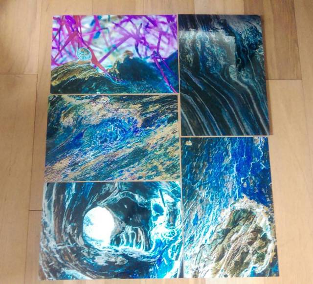
Totally mad, but it seemed to work. As I’m not able to arrange an online gallery, here’s a collage of the images created using Photoshop:

DreamsRealityCollage.jpg

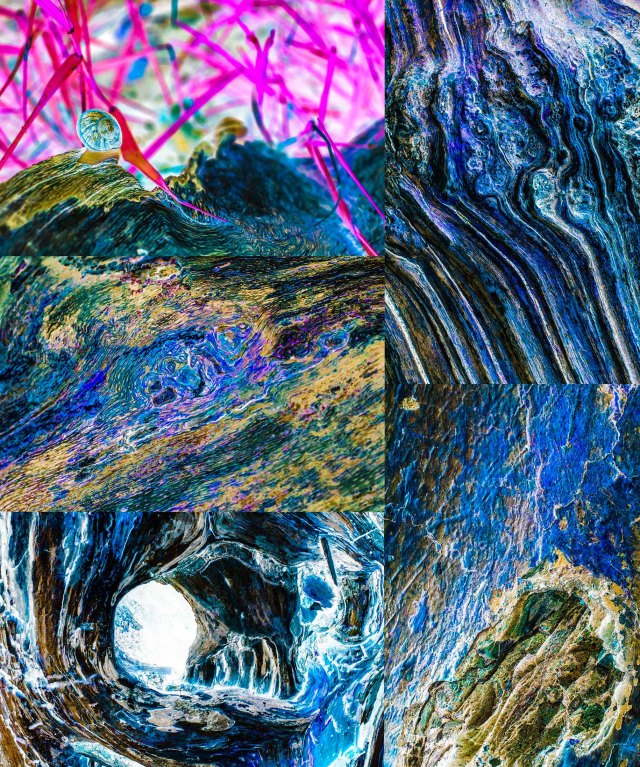
Totally irrational with a cacophony of colour & curves.

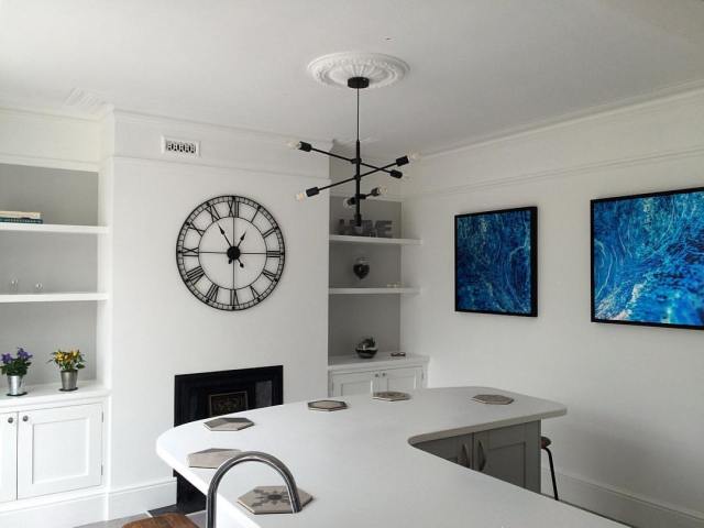
Whether the images will be arranged in this way or shown individually, who knows. I’ll let whoever puts them on the college wall for the end-of-course display. Sometimes you just have to let go of that control.

My only regret is that they’re not all aluminescent prints. That would really be spectacular!


Criteria ref: 1.1, 1.2, 2.1, 2.2, 2.3, 2.4

Dreams/Reality Final

Last, but not least, time for the appraisal of the Dream/Reality final images.

This is the final selection:

It was certainly a difficult exercise to complete as there were so many good ones from which to choose. What I decided to do was match corresponding images with their colour & form. When displayed on a wall this would have a massive visual impact. I also have a penchant for triptychs.

As for Fine Art influences, there is both a touch of Surrealism & Post Impressionism. With regards to the Surrealism, there is an other-wordly feel to each of the images. Everytime I look at them I see something slightly different that catches my eye. I’ve also had varying responses from people with their own interpretation. When looking at both form & colour, there is certainly a touch of Post Impressionism. Bold hues & brush-like strokes combine to create a painted feel.

Looking at other photographic influences, they’re similar to aerial landscape or some city images. It’s as if the viewer is looking down at some weird & wonderful water flowing from left to right. Or, as I’ve noted before, a far-off alien planet.

The other aspect which I considered in the final selection was the printing method. After seeing how the colours were transformed when printed onto aluminium, I knew that white would show as silver & the colours would ‘glow’. However, it is quite an expensive process & funds only allowed the one print. I do have further ambitions to continue with this method as it really is a perfect way of bringing my particular style to life. I can really envisage this whole selection being printed in this way on a big white wall with the light reflecting off the colours & metal – I think it would be stunning.

What I’ve enjoyed the most about this project is being able to take my photography to a higher level. By seeing what others have done & adapting their ideas with my own I’ve only strengthened my own visions & skills.

This has been a long journey of discovery that started even before this particular project came up. This journey definitely isn’t over… am certainly turning my own dreams into reality…

Criteria ref: 1.1, 1.2, 2.1, 2.2, 2.3, 2.4

Dreams/Reality Pt 18

Am currently in the process of narrowing down the final images for this project. So, in order to get an idea of which images worked together, I laid them out on the living room floor. This is a great way to mix, match & despatch to a minimum of five images.

My first selection was too big & I think the bottom line wasn’t quite right:

DreamsRealityFinal1

So I took it out. That’s better:

DreamsRealityFinal2

Again, the ones which didn’t quite match were the top row. So off it came…

DreamsRealityFinal3

Think I might just have it. I posted it on Facebook & I’ve already had the feedback from a good friend who said ‘it looks like a beautiful stained glass window’. Am liking that analogy. I think I’m now going to take another look tomorrow to see if I feel the same about this final selection. Plus, there may be other valid points of view to take into consideration.

However, regardless of the end position of this project, there’s certainly more scope for further exploration, experimentation & discovery…

Criteria ref: 2.3, 2.4

Taking a Closer Look

A couple of months ago, after using my DSLR Nikon D5500 camera for about a year,  I decided to take a step up. A new lens.

The camera initially came with an 18mm to 55mm zoom lens. This covers a wide range of focal lengths & purposes. However, this does have its limitations. But what lens is best?

When looking at the lens section of any photographic equipment website, there are a plethora of different sized-lenses starting at £90 & going up to the heady heights of £1,300 (ouch!). Zig also advised taking a look at the focal lengths you most go for. I have to admit I much preferred using the 55mm setting then moving in close to my subject.

The lens I was veering to was a 50mm, which costs around £150 (depending on which site you visit). This is ideal for portraits & getting a bit closer to the subject. Plus, it won’t totally break the bank.

The decision to take the plunge was made during the shoot when I produced the final images for the Studio Photography assignment. That was when I borrowed a classmate’s Nikon AF-S Nikkor 50mm f/1.8G Lens.

50mmLens

This 50mm lens is what’s known as a prime lens – it has only one focal length. This means you can’t zoom. To frame a shot or capture what you want, you have to get physically closer (or further away) from your subject. The perspective doesn’t change. This aspect has taken a bit of getting used to, but I’ve been persevering with the 50mm over the last couple of months with some great results. It does take a while to get intimately acquainted with the physical characteristics of your lens. Practice really does make perfect.

The other aspect of using the 50mm lens which I found frustrating is its minimum focal length – in this case, 45cm. If you really want to get closer to your subject, you have to splash the cash on a different macro lens. Or do you…

With my recent shots in Bushy Park focusing on the bark, I was getting annoyed with not being able to get close enough to frame the images I wanted to create. Then, Zig introduced us to the magical world of macro photography. This was a whole new area of photography that I hadn’t yet considered. I’m not going to go into major detail of this specialist section, but there was one accessory Zig highlighted which could help me with this particular project: extension rings.

ExtensionRings

These enable you to get closer to the subject by extending the length of the light travelling through the lens. They also cost around £25, so not stupidly expensive. However, are a few considerations. You have to use the manual focus setting otherwise the focal distance limitation is still in action. Also, as it takes longer for the light to travel to the sensor, it extends the exposure time. Ideally, it’s best to use a tripod to avoid camera shake.

After using the 12mm ring for one session, I realised that I was getting a bit too close to the subject to get the same results as my 50mm lens. I was also losing my spontaneity when capturing shots, which I found frustrating. It’s certainly something I’ll be using in the future, but for my current project, I’ll stick to my nifty 50mm.

Criteria ref: 2.1, 2.4


Dreams/Reality Pt 17

Finally, the day of reckoning came – the aluminescent print arrived! Was exceedingly excited to take it out of the box. Wow!

To recap, this is the image I used:

_DSC0805_1100_SAT_NEG

What struck me first was (as explained by Esme at The Print Foundry) the white on the digital image becomes silver. Also, as promised, the colours glowed. The process worked well with these particular shades – it’s similar to when sunshine hits oil on water.

I’ve tried to capture this on my phone – not the greatest of pics, but it gives an idea of the effect.

I was also impressed with the professional finish & aluminium mount on the back. This is a premium product & in no way appears amateur. So chuffed!

I eagerly presented it to the class yesterday & received some great feedback. Again, the aspect which did come into criticism was the level of reflectivity. It does distract slightly from the image, but it also adds to the hi-tech/cosmic element.

The other critique of this print is the framing. Or lack of it. My interior designer classmate, Paula, said her potential client would need a deep frame in black. This had to be investigated further.

When I got home later that day, I spoke to Esme at The Print Foundry regarding having a matt finish. Can be done, but another layer is put over the gloss one. As such, it will reduce the colour tone so there will be a small pay off.

With regards to the frame, Esme also informed me it that the aluminescent print could be inset into a custom-made wooden tray frame with an 8mm surround. The edges of the aluminium would be completely visible giving the illusion that it is suspended within the frame. I think that would be fabulous.

ThePrintFoundryTrayFrame_closeup.jpg

I also enquired about having some smaller prints made so I can have a portfolio to show. Can be done, so this will be my next step (when funds allow me to!). Will be interesting to see how the different styles/colour pallets react to this print process. The one which excites me is the black & white conversions. Can imagine how these would look with silver instead of white… interesting times ahead!

Criteria ref: 2.3, 2.4


Dreams/Reality Pt 16

It’s come to the stage in this project when a selective focus is required. After a day going through the criteria requirements for the course, it became clear I had to stop taking photos & do something with shots already taken.

Revisiting the images I’d captured over the last few months, it was clear that patterns started emerging.

One is the triptic – three captures of the same piece of tree, but slightly different angles. This resulted in the same colour tones, but with different shapes:

Also tried some B&W conversions…

Right, back to the files… this may take a while…

Criteria ref: 2.2, 2.3